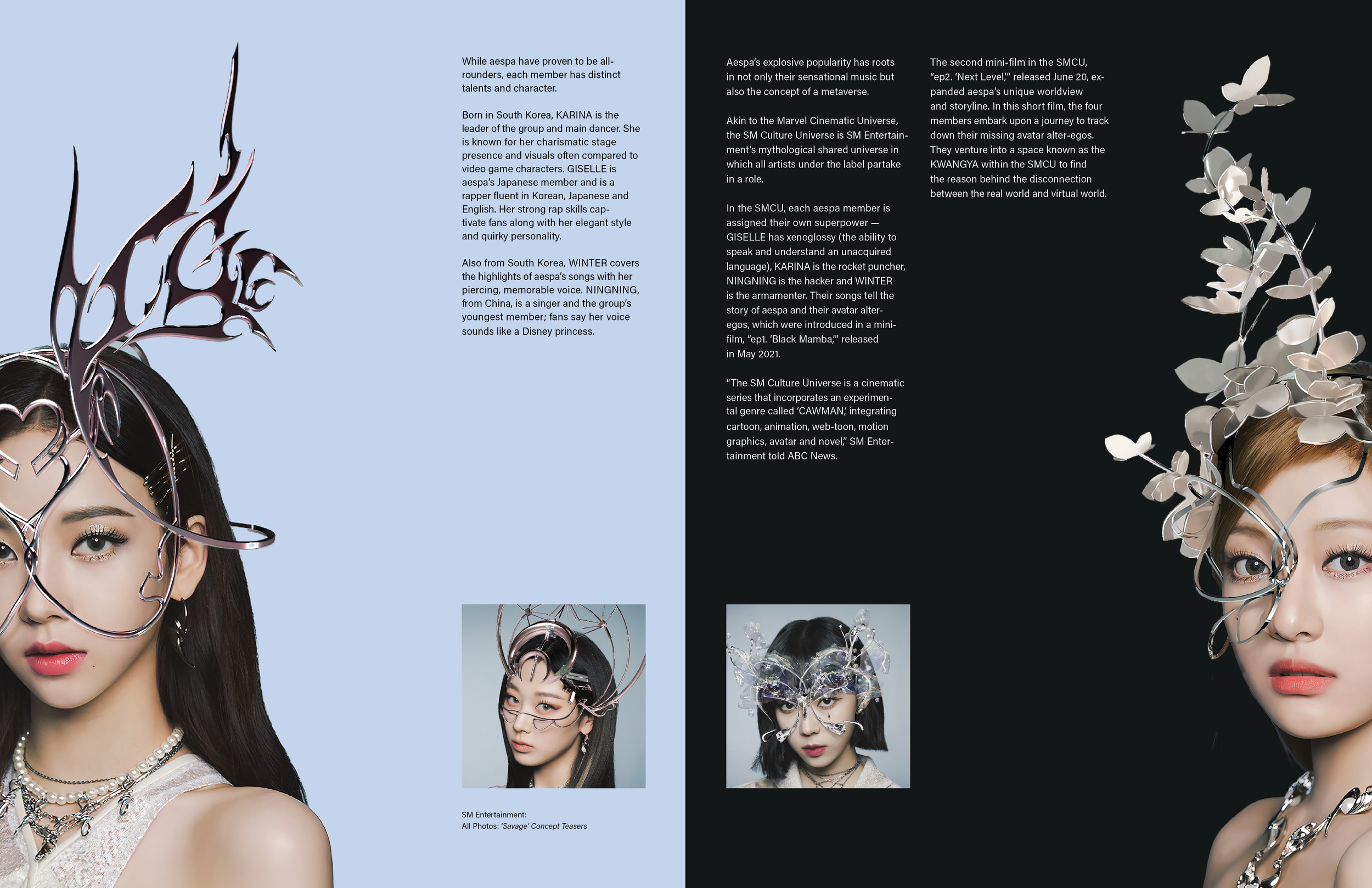
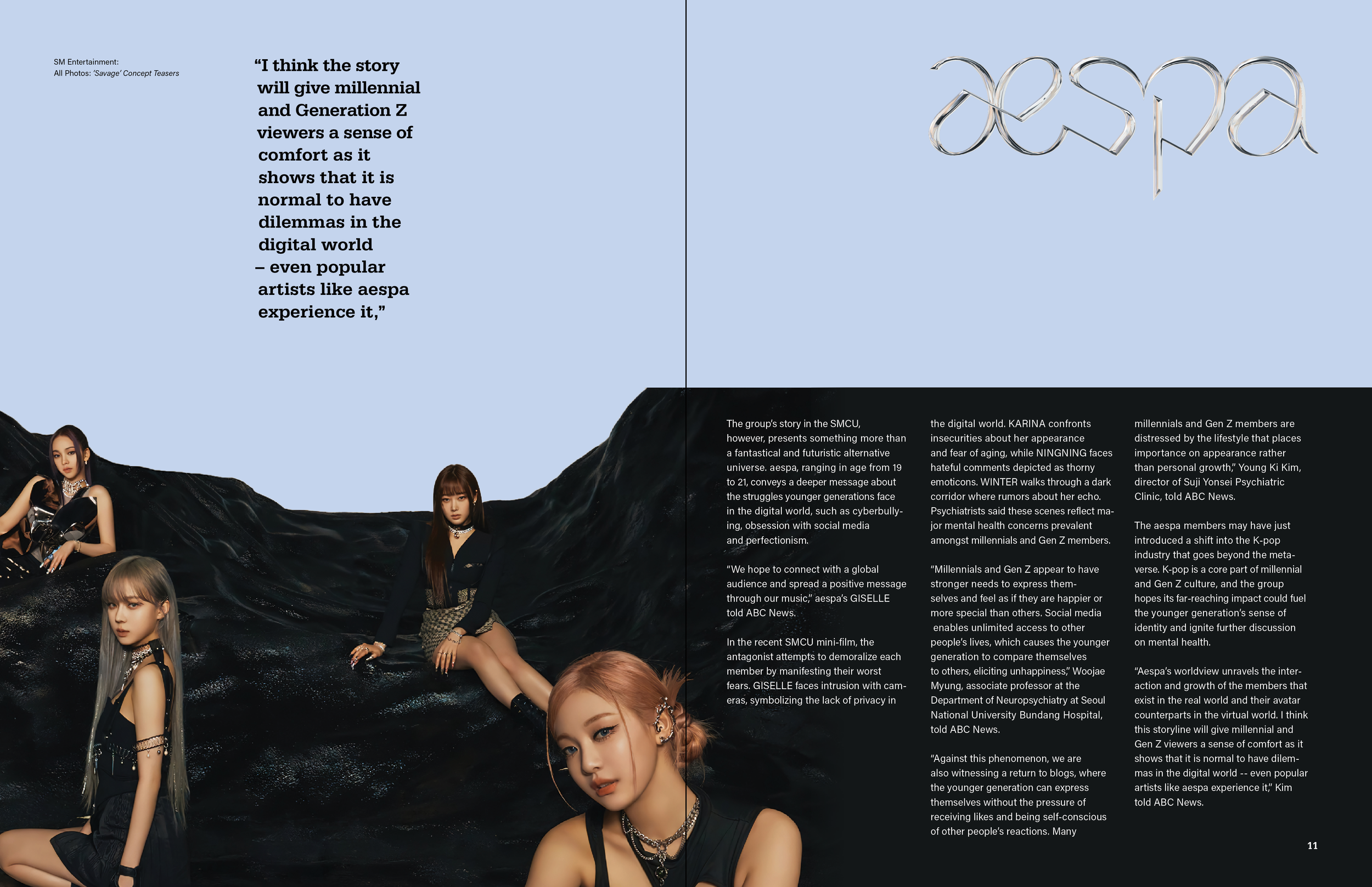
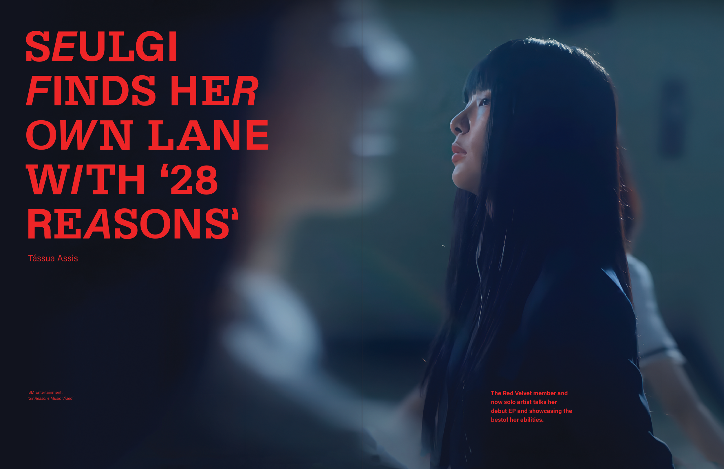
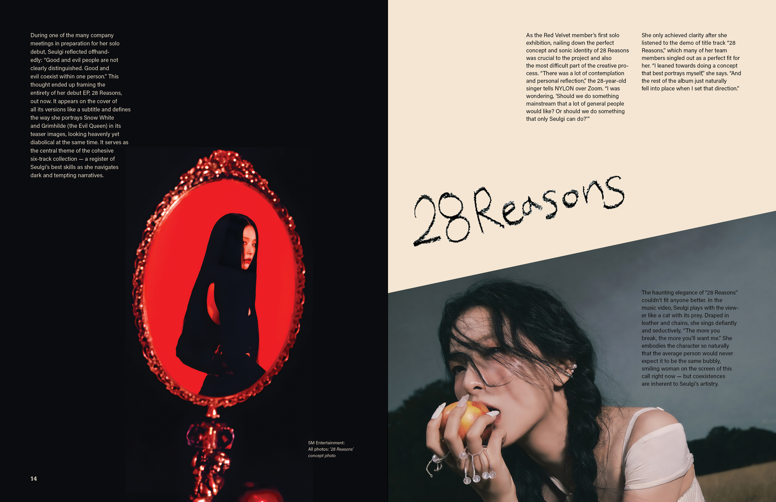
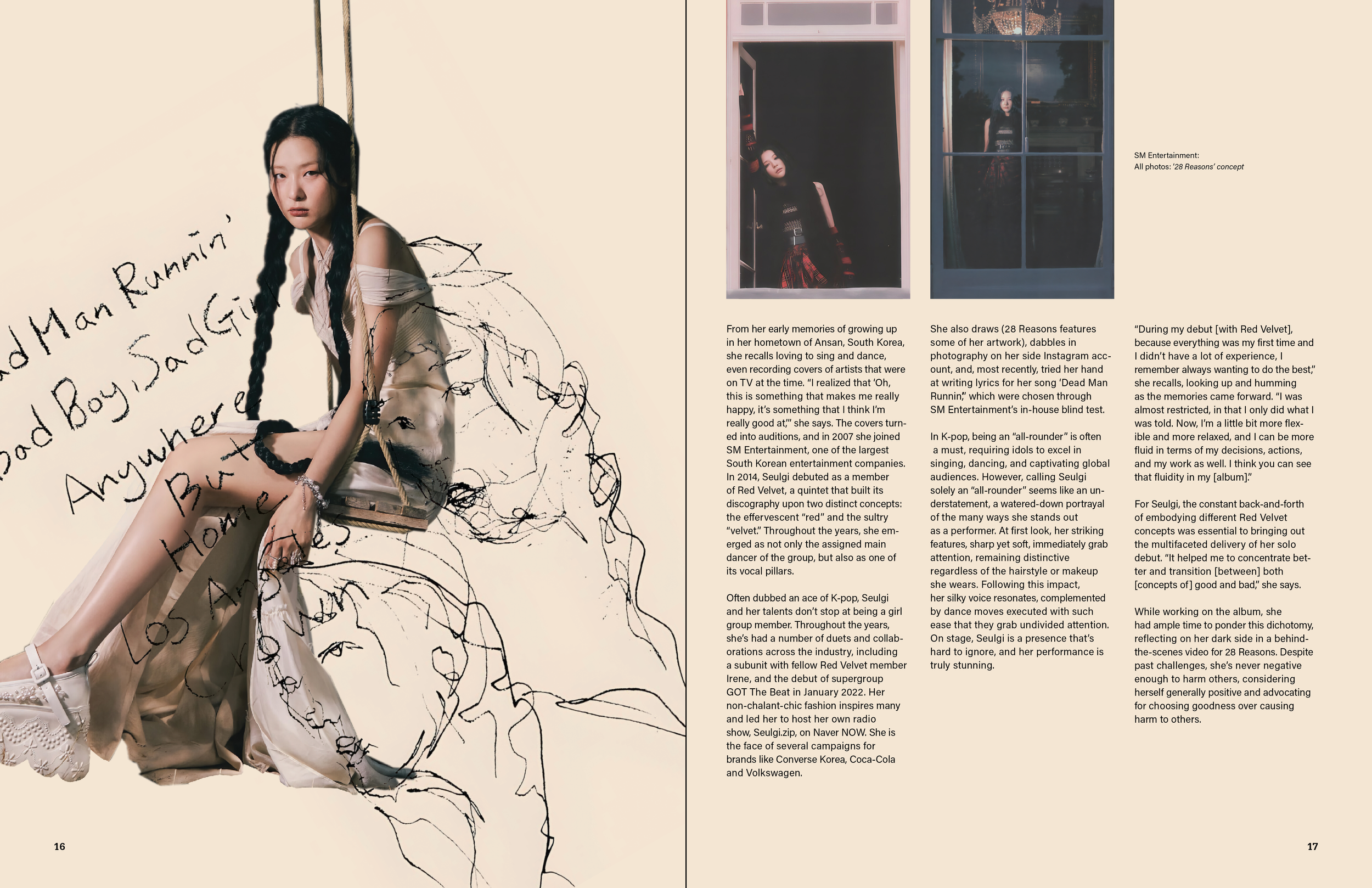
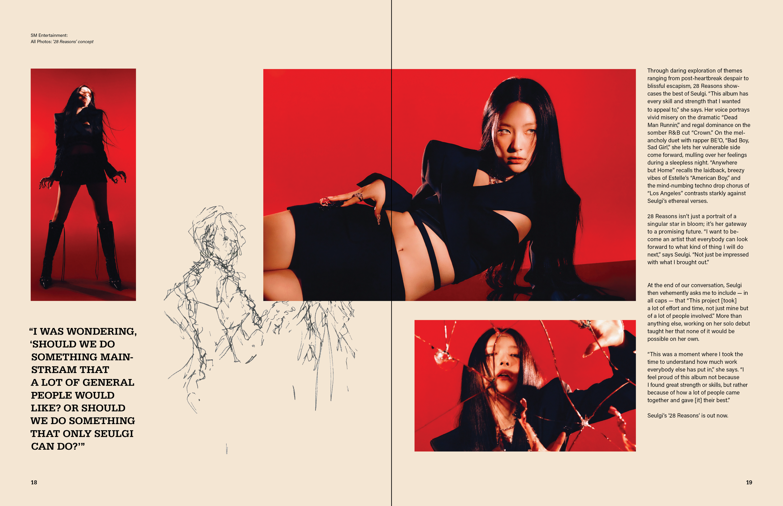
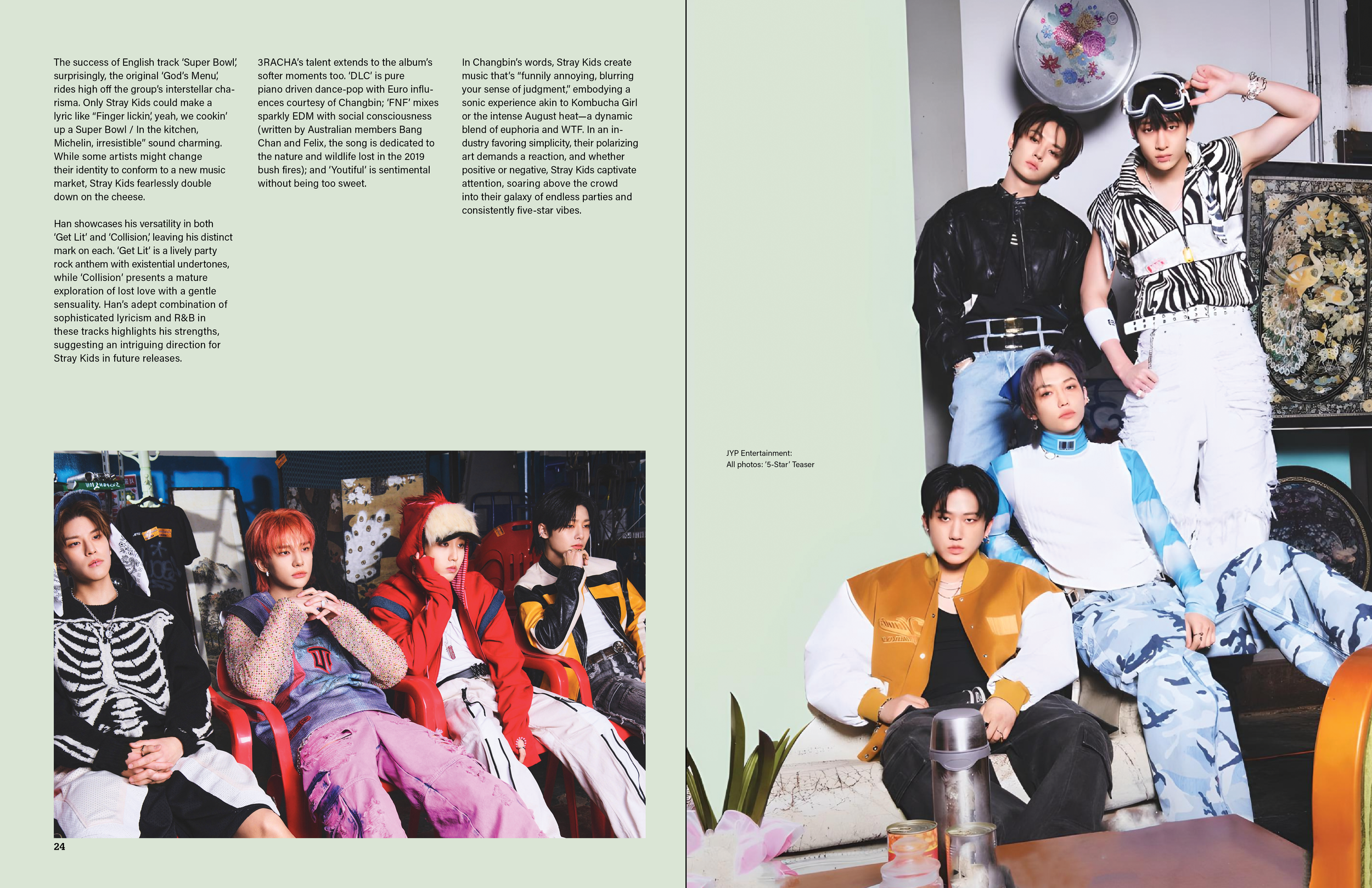
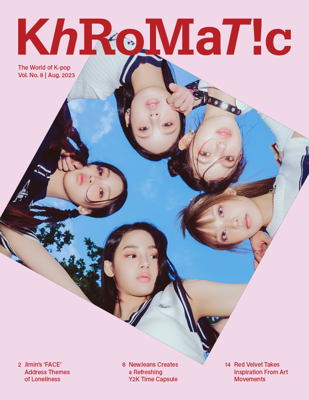
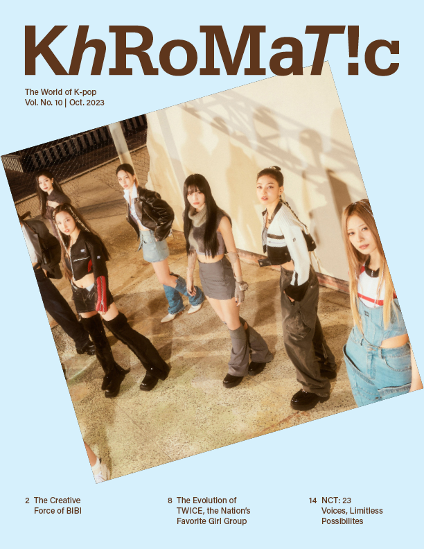
Khromatic
Identity and editorial design for a magazine dedicated to the creative concepts crafted by industry groups and artists of K-pop.
Brand Identity, Editorial Design

With the rising popularity of K-pop (Korean pop music) in the global scene, I found a lack of non-gossip English magazines. Therefore, I designed a magazine including a distinctive identity, front cover, table of contents, editor’s letter, and three articles to showcase this world. This included addressing possibilities for other volumes or editions.
Problem
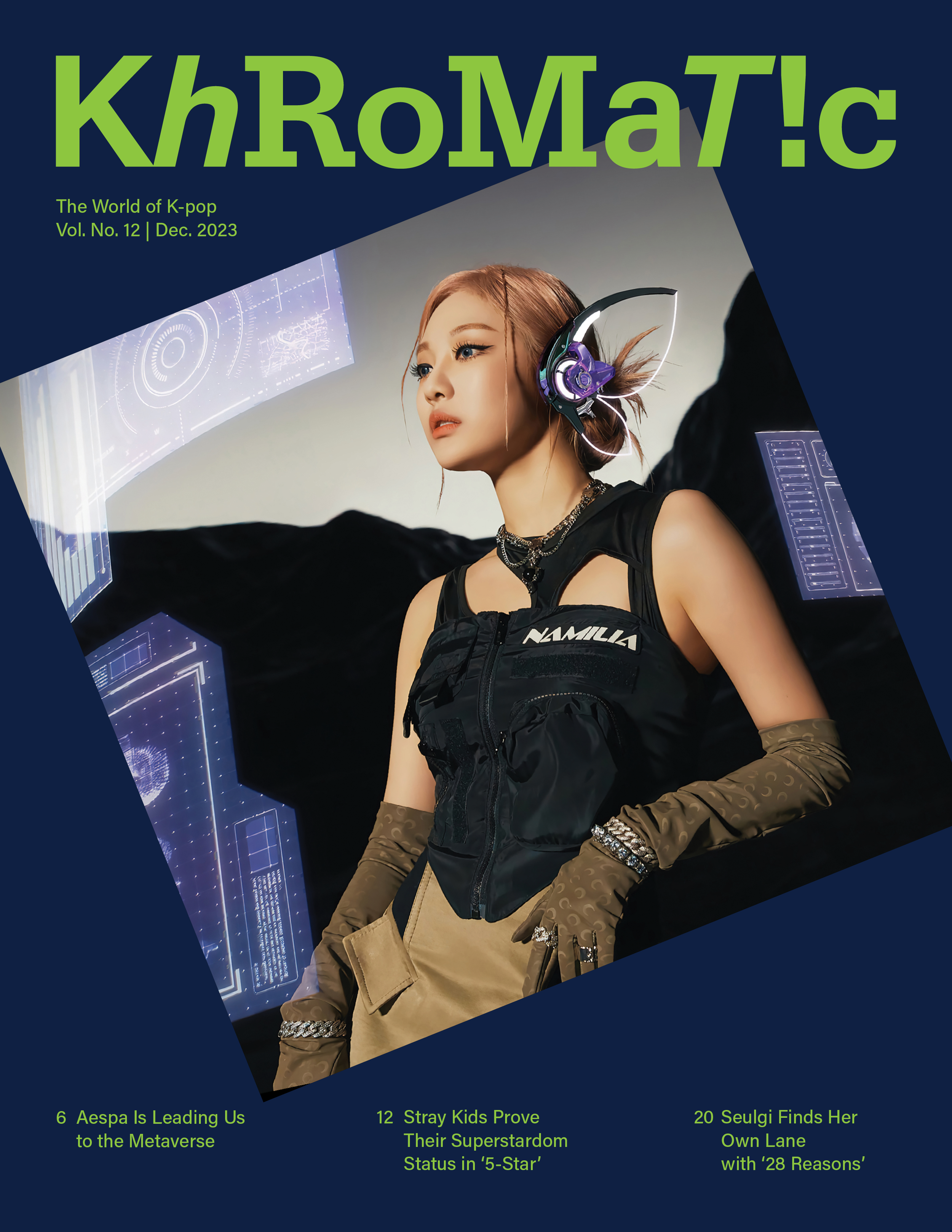
Khromatic is a magazine dedicated to the creative concepts crafted by industry groups and artists of K-pop. The name is a play on the word 'chromatic,' relating to music and color. The substitution of 'K' for 'C' represents Korea or K-pop. Given the vibrant nature of K-pop's visual concepts for each musical release, Khromatic embraces a fun and unconventional identity, employing unique uses of color, shape, and typography.
Solution
In this magazine, I heavily explored typography, especially in a magazine format for print and digital use. I designed a cohesive yet diverse publication that was engaging. I created spread compositions that were inviting and appropriate to the subject matter.
Objective